Bed styling
Gingham, Stripes and Florals: How to Mix Bedding Patterns
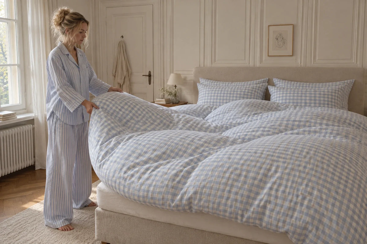
The Pattern Clinic
Love the gingham. Love the striped pillowcases. Put them together and suddenly the bed feels a little busier than you meant. Before either goes back, try changing the space between them.
Our first move would be a plain band across the top of the duvet. Keep the checks, keep the stripes, and see what happens when they stop touching. It is a small experiment you can do with a sheet you already own.
You might prefer the original. That counts as a useful answer too. The point is to find out what you enjoy before buying another piece to fix a problem you have not quite identified.
Same patterns. One plain band.
These two drawings hold the bed, colours, check size and stripe width constant. In B, a cream band covers part of the checked duvet beside the pillows. Look at the boundary between the two prints, then look at the whole bed.


We prefer B when the aim is a more restrained arrangement: the cream gives the stripes a clearer edge. A feels more continuous and patterned. Neither version needs a different duvet.
There are two separate decisions here. Scale is how large each check, stripe or flower is. Coverage is how much of the bed shows it. Interior decorator Reynard Lowell makes this distinction in his pattern-mixing guide. Our drawings isolate coverage so you can judge that change without also comparing different prints.
Try it on your bed before opening another shopping tab
- Take the starting picture. Stand where you normally see the bed, perhaps the doorway. Include the headboard and a little of the wall.
- Add a plain strip. Fold an existing sheet or lightweight plain textile across the top of the cover. Leave the pillows and everything around the bed in place.
- Take the comparison picture. Use the same position and light. This is a styling check; the folded textile does not have to become an extra sleeping layer.
- Remove it and choose. Which arrangement makes you want to leave the bed exactly as it is? If you cannot see a worthwhile difference, you do not need to buy something plain.
If the band helps but you dislike another layer, try plain pillowcases instead. Return to the starting arrangement first, then change the cases alone. Otherwise you will not know which change you preferred.
If neither helps, look beyond the number of prints. Perhaps you dislike one colour, the contrast is stronger than you wanted, or the wallpaper already competes with the bed. A plain strip cannot make you love a fabric you never liked.
For a crisp, graphic bed, give the repeats different sizes
Checks and stripes can share a palette without becoming a matching set. In H&M HOME’s Fall 2026 campaign, styled by Lotta Agaton, the near-neutral colours stay closely related while a broad windowpane check sits beside a much finer stripe.

To try that idea with your own linen, put a fine stripe beside a visibly larger check and look from the doorway. If they seem to merge into one restless field, introduce a plain case or try a larger difference in repeat size. Keep whichever version suits the room; there is no required pattern count.
For a collected look, let a floral suggest the connection
A floral brings several possible colours with it. Pick one you actually like, perhaps a leaf green or faded rose, and look for it in a piece you already own. The colours can be related without being identical. A slightly imperfect combination can be more interesting than another complete set.
Hannah Voak’s Piglet in Bed guide to styling gingham shows checks alongside stripes, plains and florals. Use those examples to compare relationships rather than feeling obliged to reproduce a whole bed.
We would keep the favourite floral visible and test its neighbours. A cream-backed print beside warm white may feel quieter to you than the same print beside a strong pink. If the strong pink is the part you love, keep it. The quieter option is not automatically the better one.
The headboard is part of the mix

In this illustration, the headboard gives the pale stripes and checks a darker green to relate to. Cover that part of the picture with your hand and the bedding reads differently. It is worth including your own headboard, rug and walls when you judge a new combination.
Studio McGee’s bedding demonstration takes colours from a patterned quilt into the surrounding layers. We would begin the same colour search with something you want to keep, rather than assuming the largest piece needs replacing.
Buy for the missing job
After the experiment, your list might be one plain pair of cases, a different-scale stripe, or nothing at all. Check colours in daylight and lamplight before committing. A screen image is a starting point, not a dependable fabric swatch.
Then separate styling from comfort. A print does not tell you the cover’s feel or care requirements, or the warmth of the filled duvet underneath. Compare the actual cover and insert dimensions before ordering, especially across countries. YumeFeel’s size guide lists its current measurements; check another maker’s measurements separately when pairing products.
Still deciding on the colours? Our bedroom palette guide is the next place to look. For now, keep the piece you love and give it one different neighbour.
YumeRest is YumeFeel’s bedding journal. These are our styling judgments, informed by the credited sources and images, not results from a physical product test. Third-party designs are identified for editorial discussion and do not imply endorsement.


