Bedding Colour
Which Bedding Trends Are Worth Trying in Your Own Room?
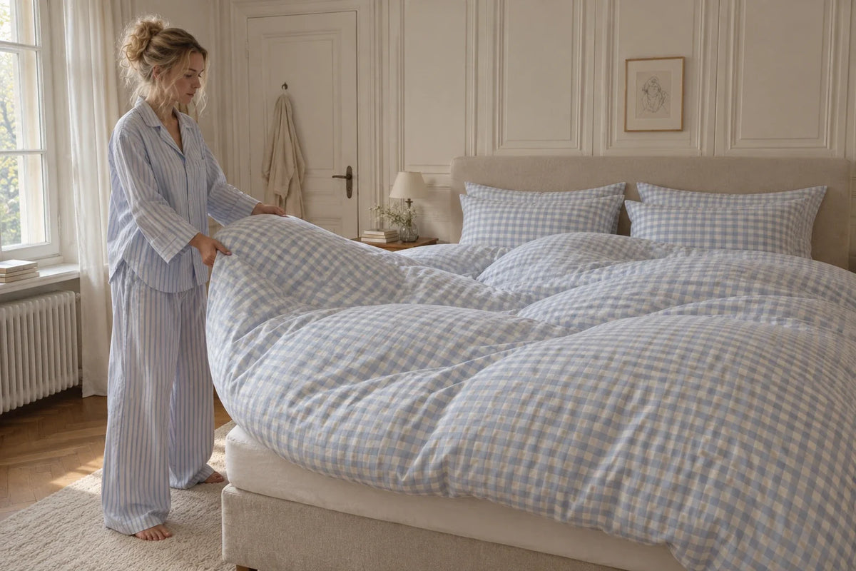
One article says big florals are back. Another says they are over. Your saved rooms are full of blue, but the cover you already own is pink. You can enjoy the ideas without treating every forecast as a replacement notice.
A bedding trend is worth trying when it improves a room you actually use: a colour that connects the furniture, a pattern you enjoy from the doorway, or a small detail that makes an ordinary bed feel more personal. Start with the smallest change that can tell you whether the idea belongs there.
A familiar check can carry plenty of colour without needing a completely new room. The opening image is a YumeFeel campaign styling illustration; its blue pattern is not a current YumeFeel cover listing.
What the 2026 forecasts really tell you
Pinterest’s January 2026 Palette names Cool Blue, Jade, Plum Noir, Wasabi and Persimmon. Pinterest combines global searches and saves, visual analysis and expert curation. That makes it a useful collection of colour directions. It does not establish which duvet colour sells best in your country, or which one will suit your bedroom.

Even informed design forecasts disagree. In his February 2026 Livingetc bedding report, James Cunningham highlights larger florals among the ideas designers are using. Amy Lockwood’s December 2025 Ideal Home forecast for 2026 favours smaller, softer floral treatments. Read them as two aesthetic positions you can consider, not a vote that your existing cover has failed.
The order we would try things
Our ranking is about commitment, not which look is most fashionable. Move down only as far as you need to answer the room question.
- Rearrange what is already there. Reveal more of the top sheet, turn a reversible cover or move an existing throw. This can change the colour balance without adding anything to the cupboard.
- Borrow a colour. Lay a scarf or fabric sample where a pillowcase or turnover would sit. Use it to judge colour only, not how bedding will feel or wash.
- Change one usable piece. A pair of cases is a reasonable first purchase when you need cases and like the fabric. A small decorative object is not automatically a saving if you have nowhere to use it.
- Consider the full cover. Commit to the largest patterned area after checking it against the floor, headboard and curtains. Choose its actual dimensions and care requirements with equal attention.
Try a colour in a small amount
If a deep plum room makes you pause mid-scroll, try that depth through an existing textile before buying a full cover. Keep the cover and furniture fixed. Change only the accent, then look from the doorway and from the pillow. Does the dark area create a pleasing outline, or hide a detail you liked? Taking away the accent is part of the comparison.

Blue is another useful example. Colleen Brockwell’s September 18, 2026 Brooklinen guide to blue bedding presents several shades and finishes from the US brand’s own range. It is styling and product guidance, rather than proof that one blue dominates American bedrooms. Use the idea to compare a pale, muted and deep blue against your own room, instead of ordering by the colour name alone.
Choose the scale of the pattern for the view you have
You experience a duvet up close and as a large surface across the room. A fine floral that delights you while making the bed may read as a nearly solid tone from the doorway. A broad stripe may keep its shape at that distance. Neither outcome is a fault; decide which one you want.


Before adding another print, compare its scale with the pattern already on the bed. Our guide to mixing bedding patterns shows how to give the eye a clear starting point. You can keep a large floral you love even if another editor prefers a tiny one.
Keep decorative texture away from jobs it cannot do
A fringed throw can be lovely at the foot of the bed without becoming the fabric against your face. A heavy coverlet may complete a photograph while adding more warmth than you want overnight. Decide which layer is for looking, which is for sleeping, and where the decorative piece will go when you turn in.
In Canada, Wendy Jacob’s February 2026 House & Home decorating forecast describes the bed as a place for layered texture, pattern and personal expression. Take the useful invitation to arrange what you have. It does not require a mountain of cushions or a wholesale replacement of your bedding.
Give the idea an exit condition
Choose one sentence before you shop: “I want the pink cover to connect with the wood,” or “I want a little pattern without losing the plain bed.” Photograph the starting arrangement from the doorway, try the single change and look again in your normal evening light. Keep the camera position similar so you are comparing the room, not a flattering angle.
Keep exploring if the change solves that sentence and the bed still works for sleeping and making.
Stop here if it only works after hiding the curtains, replacing the headboard or buying several more colours. You may like the saved room more than you like this idea in your own room.
This is why we like the contrast between the arrangements in Lone Fox’s bed-styling video. The same setting does not flatter every arrangement equally. Treat a creator’s room as one worked example, not a shopping list that will reproduce itself at home. The video includes a mattress sponsorship and products from the creator’s shop.
There is no need for the same seasonal move in every market. A September autumn story from North America or the UK is not a warmth prescription for an Australian spring bedroom. Your local weather, room temperature and preference matter more than the publication calendar. Keep a colour idea separate from a decision to buy a warmer insert.
If you are buying the duvet underneath the look, YumeFeel’s guide to loft, warmth and weight answers that different question. For the surface you see, a trend has done enough when it helps you notice one useful possibility in the room you already have.
Source review: October 1, 2026. YumeRest is YumeFeel’s bedding journal. Our trial order is an editorial recommendation; the linked forecasts and brand guides are not country sales rankings or reports of our hands-on product testing.


